How a Team of Calligraphers Brought Jane Austen’s Fictional Letters to Life
You can now hold Mr. Darcy’s dispatches in your hands.


The sight of Jane Austen’s three-legged, walnut writing table in Chawton, England, sometimes moves visitors to tears. It’s easy to picture her in the brick house where she penned Sense and Sensibility, Pride and Prejudice, Emma, and more—arm draped over the table, hand racing across the page. The same is true in the city of Bath, where Austen lived from 1801 to 1806. There’s something “transporting” about seeing what Austen may have seen, or retracing the paths she may have walked, says Barbara Heller, a self-professed Janeite. Places and objects can make visitors feel a proximity to the writer, who died in 1817. “It’s a visual, tactile connection across time,” Heller says.
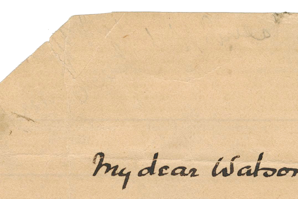
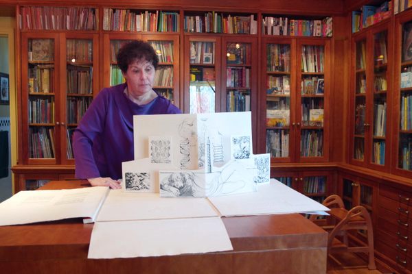
After reading Pride and Prejudice “a gazillion times,” Heller wondered whether a special edition of the novel could capture the texture of Austen’s life and times, and bring readers closer to the characters. Heller had loved encountering the letters that are woven into the book, and she started thinking, “I would love to have that letter; I would love to hold it in my hands.” That’s how she came up with the idea of a tactile version of Pride and Prejudice. Newly released through Chronicle Books, it allows readers to pull 19 letters out of actual envelopes that are tucked into the text. “Handwriting and letters are such strong personal connections,” she says. “For those of us who love Pride and Prejudice, those characters are your own friends.”
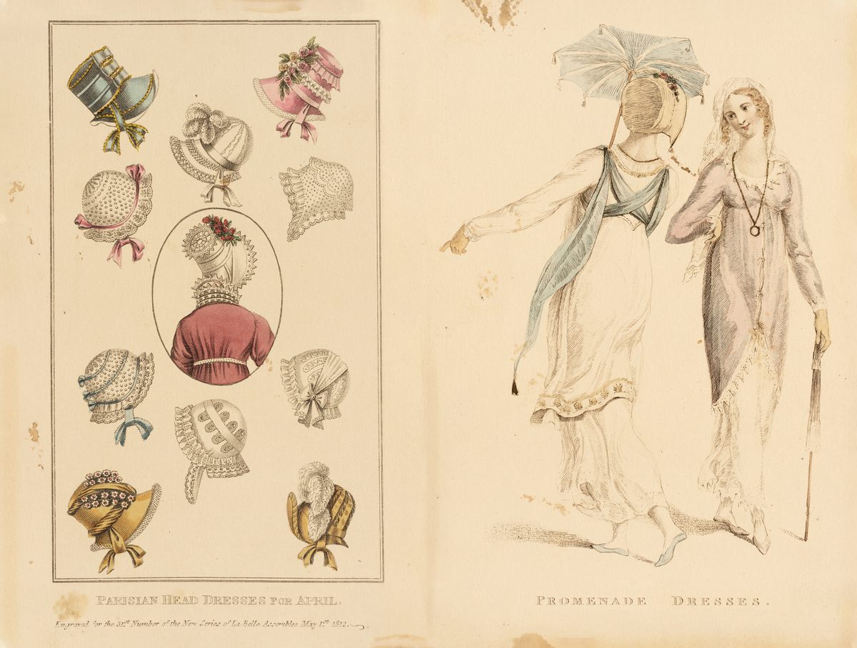
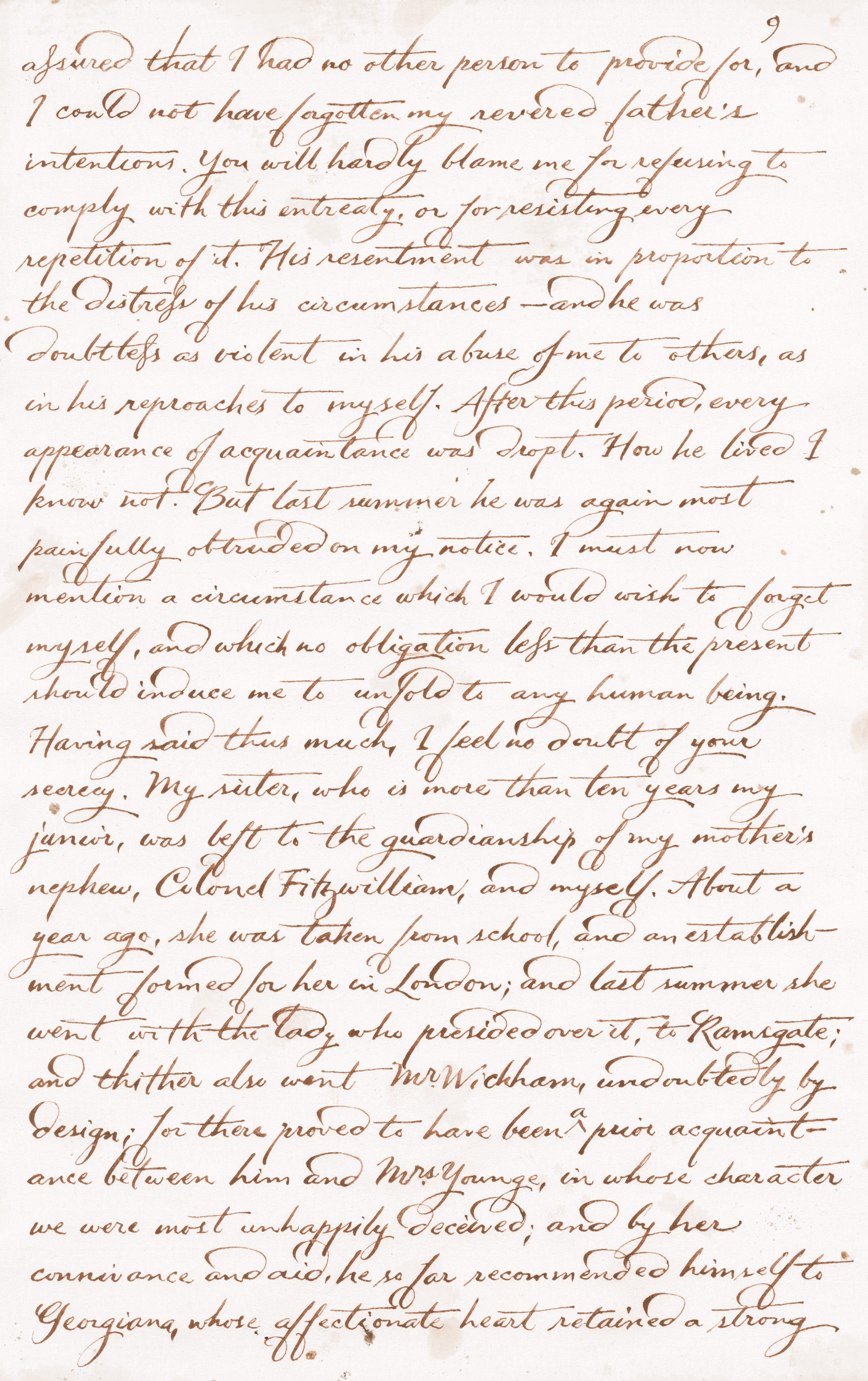
Heller wanted to capture each character with different handwriting styles, ink colors, and even types of paper. (Lydia’s, for instance, is dashed off on the back of fashion illustrations from magazines.) Heller also took inspiration from Austen’s own handwriting. At the Morgan Library & Museum in New York, she pored over the author’s correspondence and decided to adapt her script to capture the “intelligence, wit, and playful spirit” of Elizabeth Bennet. Heller also borrowed some habits from Austen’s letters, such as signing off with initials. Mr. Darcy’s handwriting is inspired by Prince Edward Augustus, Duke of Kent and Strathearn, whose writing style struck Heller as “elegant, confident, and educated.”
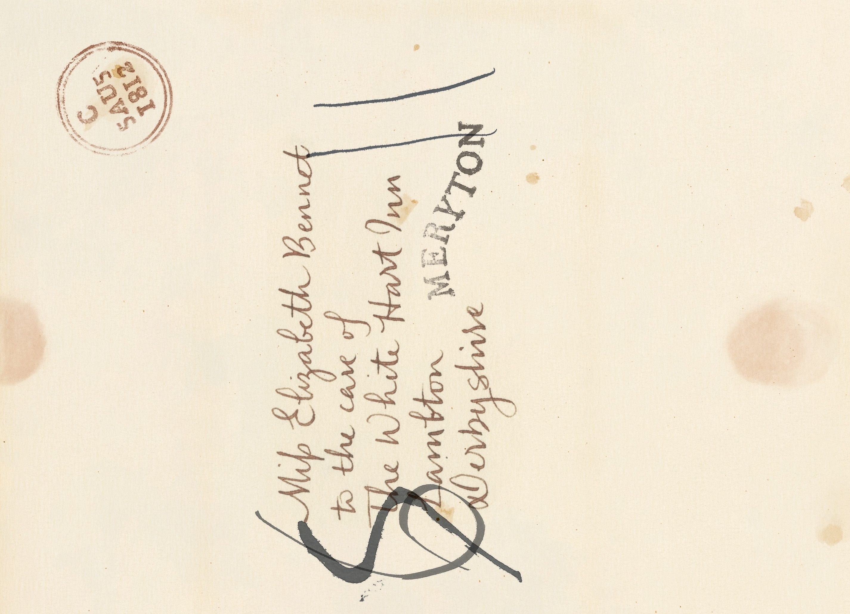
“I wanted the letters to be as historically accurate as a fictional letter could be,” Heller says. She even consulted a postal historian. Postage was based on the number of pages, she learned, as well as the distance to London. For that reason, some writers scrawled their messages in the tiniest text they could muster. (If a letter continued on after arriving in London, the initial rate would be scratched out and replaced with a new squiggle.) She also dipped the letters in tea and sprinkled them with coffee grounds, to emulate the look of preserved letters from the period, which would be repeatedly folded and unfolded. “I didn’t want it to look like pirate maps,” she says.
Most important of all was getting the handwriting right—and for that, Heller turned to professional scribes. Atlas Obscura spoke with Chavelli Tsui, one of the calligraphers who brought the letters to life.
How did you and Barbara decide how to translate characters’ personalities into handwriting styles?
I was cast as Jane Bennet and Caroline Bingley. Jane is a very sweet kind, authentic person. That contrasts so greatly with Caroline. I think because I had two characters that were such contrasts, it really helped delineate how I could differentiate them from each other.
Caroline is full of excessive flourishes—big, flashy crossbars and strokes. Barbara had done a ton of research, and she really liked this over-the-top lowercase “d” that swings dramatically across the other letters. We found it in a letter from Austen’s day, so it was true to the time. The calligrapher in me thought, “Maybe I shouldn’t make it too big.” But there was a lot of back-and-forth with Barbara, because she really had a vision to make Caroline seem as superficial as possible, like her character actually is.
Jane’s writing is more upright. It’s a little smaller, there’s more spacing in her strokes and in between her letters—kind of more breathing room. One of the letters she writes in a hurry, a bit of distress. That’s also reflected in how I wrote it. Even though her writing is a bit tidier, in that particular letter, it devolves into more of a scrawl.
What materials did you use?
Initially, I had talked to Barbara about using a quill, but I used a steel nib that I’d modified to move the way I wanted it to, to achieve the right type of stroke in the letters. That gave it a feeling from that period, rather than modern, more precise tools.
What did you keep in mind while writing?
How do I maintain that style throughout a whole piece of writing, considering it’s not my own handwriting? It was just a matter of really understanding the text and the character’s state of mind. It kind of came naturally, because I was reading the text while writing. To be accurate and not miss words, I had to have the text right next to me, to copy from. Each letter was written many, many times, to get it to look just right.
How did you loosen up and step into the characters?
When I work on formal calligraphy, it’s a lot slower of a process. Every stroke is quite intentional, even if it looks like it’s fast. I found that, doing these letters, it worked best for me to also write as quickly as a character might have.
I also brought in my own knowledge of how I would write in different situations, whether it’s a shopping list or something different from formal calligraphy. While I brought a lot of my lettering knowledge as a calligrapher to the development of the writing style, ultimately I kind of wrote as a non-calligrapher, so it would look less formal and have more personality.
When I was writing, especially with Caroline, I said the words out loud, or at least in my head, the way I imagined her to—with a high-pitched voice, figuring out how she would accentuate and emphasize certain words, what her intonation would be. I would dot the ‘i’ in a very exaggerated, pointed way if I thought she was making a point in that sentence. If I thought it was a haughty tone, I would haughtily stroke the “t” crossbar across the page. It was almost as if I was acting her out, so it would come across in the letter.
This interview has been edited and condensed.


Follow us on Twitter to get the latest on the world's hidden wonders.
Like us on Facebook to get the latest on the world's hidden wonders.
Follow us on Twitter Like us on Facebook